
Have you ever heard of the term pescatarian redwoods? That’s what Patrick Webster, an Underwater Photographer (and former Seymour Center teammate), calls kelp forests. Patrick’s breathtaking photography shares and connects us with what is under the ocean’s surface. Patrick generously allowed us to feature his photographs in our aquarium’s refreshed signage and labels, which we unveiled last week.
Led by Seymour Center’s long-time Aquarium Curator, Peter Macht, we had three objectives when we set out to improve the experience you have in the aquarium:
- More readable — make the written content more accessible to more people
- More interesting — deepen opportunities to engage with what’s in the tanks
- More beautiful — give it a visual upgrade
MORE READABLE
You may be a scientist, scientist-in-training, or new to science. You may know all about Monterey Bay, or you may not know this is a bay at all. English may be the language you are more comfortable with. Maybe it is Spanish. No matter where you come from or what you bring to the table, it is our responsibility to meet you where you are. That is why we made our written content more accessible to all of you.
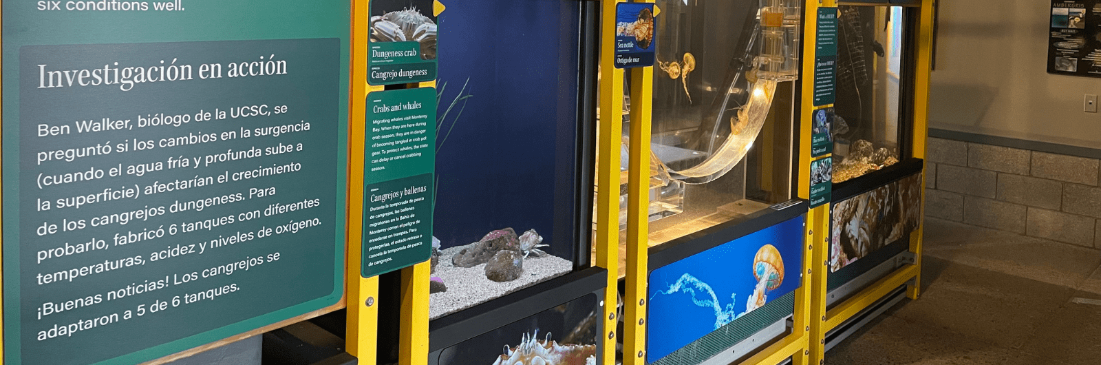
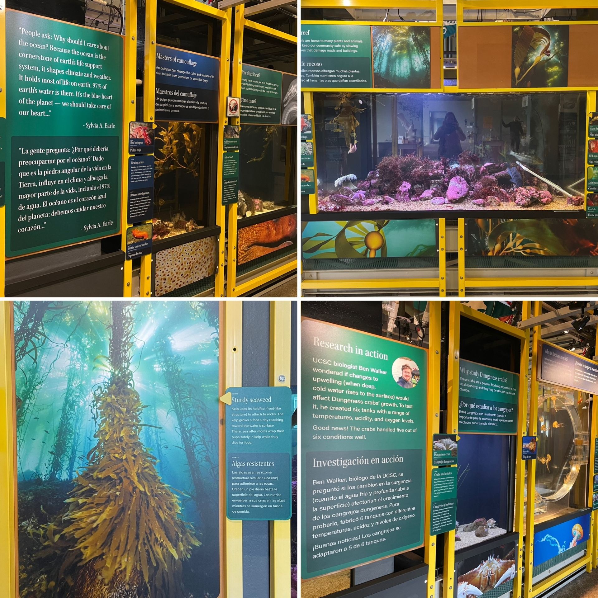
The first thing you will notice is that the aquarium labels are now in English and Spanish. I am proud that our exhibit hall is now nearly 100% bilingual.
We also introduced a new structure to the information we present. We know that some aquarium visitors—myself included—like to read the Cliff Notes. If you are like me, you will be delighted to find a single sentence or question written in large text above each tank. Other visitors, like our Youth Programs Director Kevin Keedy, like to dig into each detail on each label. We have something for you, too. Alongside each tank, you will find a deeper dive into the information about the species you are looking at.
One of the most challenging—and most rewarding—parts of our work is distilling scientific research into language that we can all understand. That is why we spent countless hours simplifying the language on each label. That way, everyone can understand the ideas and questions that we think you will find interesting and important.
MORE INTERESTING
Peter Macht crawled on his hands and knees to understand what the aquarium would be like from a toddler’s perspective. This simple exercise helped us quickly understand that the experience for young children is limited by the height of our tanks. Lowering all of our tanks was not an option, so instead, Peter filled the ground-level space with “Peekaboo Photos” — large, high-resolution, close-up photos of the species in each tank. That way, a young visitor can stare eye to eye with a Dungeness crab before looking for it in the tank.
One of the pieces of feedback we hear from you is that you like that we present the latest UCSC marine science and ask you lots of questions on our labels. So, we leaned more heavily into that. We present new UCSC research and ask you even more questions to invite you into the scientific process. We also feature more content that is hyper-relevant to Santa Cruz and the Monterey Bay.
MORE BEAUTIFUL
All of the elements I describe above require a keen eye for visual design. In addition to the myriad decisions they made in those steps, Jordan Boudreau, our Associate Director of Community Engagement, implemented several other deliberate visual upgrades.
First, to create a more consistent and cohesive visual experience, we brought all of the colors and fonts into alignment with the rest of the exhibit hall. All of the aquarium labels now feature modern colors and fonts.
With all of the wonderful natural light in our exhibit hall, we sometimes struggle to reduce the glare in the tanks. Glare can be distracting and take you out of the moment. That is why Jordan designed all the labels to have white text on darker backgrounds, thereby reducing distracting reflections.
You may also notice that the labels related to each tank alternate between dark blue and dark green. It is beautiful and gives more depth to the aquarium. Yet, it serves an important functional purpose. Alternating between blue and green labels makes it easier for you to know which label relates to which tank.
No matter how comfortable you are with science, how much you know about Monterey Bay, or which language you feel most comfortable with, nothing beats seeing the otherworldliness of an octopus, the grumpiness of a monkeyface prickleback, or the weirdness of a fat innkeeper worm. We hope that these design improvements only enhance your learning and your experience when you visit Seymour Center.
Thank You
Special thanks to longtime Seymour Center volunteer and supporter, Dale Bieser, for putting countless hours into this project alongside Peter and Jordan. Thanks to Iris Lam for the bespoke illustration of a flatfish’s eye moving from one side of its head to the other. Thanks to Patrick Webster for letting us feature several of his photos. Thanks to the many volunteers who helped install the new signage.
Finally, thank YOU for visiting Seymour Center, for becoming a member, and for generously donating your time and money to make this project possible.
See you in the new aquarium soon,
Jonathan